Buckle Street Studios
In the Aldgate East neighbourhood of London, Grzywinski+Pons signed a dense and varied assemblage of buildings including apartments, co-working space, a coffee shop and more.
The Buckle Street Studios
Located in a district where traditional and new high rises are adjacent.
During the planning process, Grzywinski+Pons worked alongside the municipal authorities to ensure their design fulfilled the aspired role of architectural intermediary both in mass and articulation. The architects specified materials and defined their formal language to temper the architectonic jump from the smaller historic buildings to more recent tall developments.
Buckle Street Studios is a new thirteen-story building comprised of 103 compact apartments, a mezzanine co-working space, a coffee shop, meeting rooms, and a concept store.
Grzywinski+Pons employed radiused corners and transferred much of the scheme’s structural load to an expressionistic double-height parabolic arch at grade to make the building sit softly within its block all the while drawing inspiration from the round-headed windows, arched cornices, and rounded quoins of the heritage buildings on the neighbouring streets.
The building’s mass is articulated in three sections
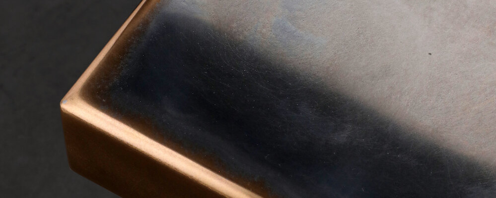
The base of the building is clad in rusticated, nickel-finished metal panels composed in a modern take on a progressive ordered scale. The fenestration on all three building tiers is comprised of the same nickel finish metal and the coffered panels serve as spandrel covers and artful ventilation grilles while harmonising the stratified facade. Above this pediment, Grzywinski+Pons used a warm grey hand-laid water-struck brick with projected soldier courses at the spandrels and a projected cornice below the material shift at the base of the crown. The brick spandrels and other transitional detailing imbue the already richly textured skin with even more depth.
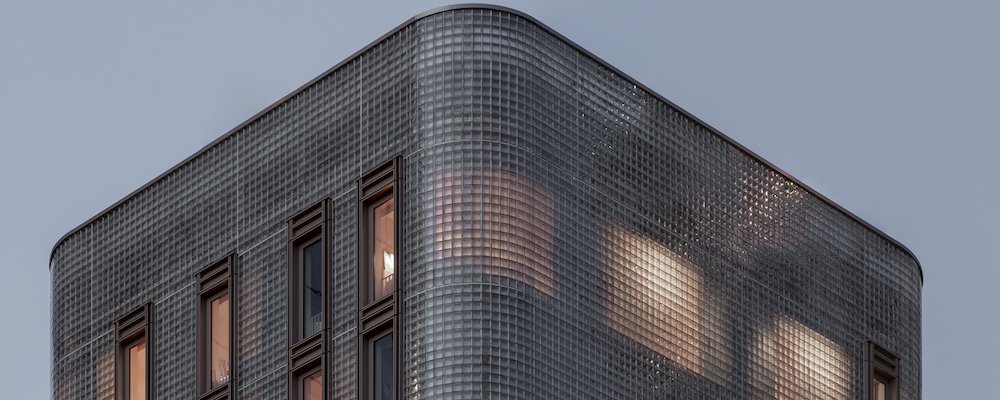
The diaphanous crown of the building was designed to be equally proportionate to the base and is clad completely in a glass block. The architects specified a winged block that is thermally efficient, luminous, and like the brick below, has texture, gravity, and permanence. The subtle, diffuse luminance of the rooms when lit from within softly animates the crown.
For maximum thermal and acoustic efficiency, the crown’s envelope is a twin-wall assembly with the outer skin acting as both spandrel and parapet. We raised the parapet wall to completely cover all of the equipment on the roof while its translucency generates a diffuse and gentle termination of the top of the building into the sky.
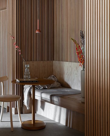
The principle organising element of these areas is the parabolic arch. Legible from the street through expansive glazing, it also supports and defines the mezzanine within to the double height space at grade while consolidating the load of the front half of the building above. The structural expressionism is softened with an integrated timber balustrade and fluted paneling, clay plaster finishes, dress curtains, and soft furnishings. The floors and skirtings of fixed joinery are clad in brick congruent to the building’s facade.
Grzywinski+Pons created vitrines from rhombic volumes clad in porcelain and glass to display and elevate the curated merchandise of the concept store and surrounded them with curved banquettes, sofas, and soft stools that promote lingering. The space lies at the crossroads of art and commerce. Equal parts gallery, lounge, coffee shop, retail concept, and living room, the space beckons to the street and is as welcoming as it is inscrutable. It is our hope that passers-by will feel compelled to come inside to further discern what, exactly, it is, and then feel free to get comfortable and stay a while.
In the apartments in the crown, all the allure and utility of the luminous glazed cladding confers advantages to the interiors. The low iron glass and specular reflective sidewalls of the blocks amplify the warmth and brightness of the space.
Lower in the building, these organic materials have their texture and depth amplified by the directional pooled light from windows we positioned to maximise views and mitigate overlook.
The architects also designed the furniture to implicitly organise small spaces into areas for disparate activities. They took some inspiration from the cabins of boats where quality and comfort transcend compact proportions. By linking custom sofas to beds and designing compact tiered tables, shallow linear shelves, and hanging timber trays, the imperative to efficiently facilitate functionality yielded a comprehensive aesthetic that manages to feel luxurious.
The palette: blush tinted clay, sage, timber, jute, creamy stone, and velvety neutrals, further contribute to the plush serenity of the studios.


