#BrickWeek 2 - Roly-Poly Cotto By StudioVASE
Seoul can wrongly be categorised as another heartless metropole. It has a discreet charm with plenty of little gems for the visitor (or resident) that knows and takes time to explore. Here is a new one for your list.
Season Two, Episode Four: Roly-Poly Cotto
The district of Gangnam is the perfect playground to browse fashion and design stores but also original restaurants and cafés. It is more than an experimental or launch platform for most of them, it also become the place to be to settle a brand.


Roly-Poly Cotto is a project that involves and intervenes in all parts from naming, spatial planning and design, styling, product design, and even graphic design. Initial requested space was planned to sell curry and ramen on an area of about 265sqm (or 80 pyeong), but was expanded to about 1,024sqm (310 pyeong) by suggesting the possibility of expansion through using remaining space.
The simple composition just selling ramen and curry made soon turned to a little more complex one in order to attract a young crowd without imposing the brand’s image too strongly.
Ottogi, the food company behind Poly-poly Cotto has a good image, but somehow conservative in its imagery. Thus, the brand is not relatively progressive or elegant.
StudioVASE came up with a concept to bring a positive and emotional image with an innovative, kind but strong, friendly but sensuous identity. To do so, they thought that more complex than simple, more emotional than provocative, more analogue than digital, that would be the solution as a non-temporary and sustainable space.


The design combines the gardens hidden in two existing buildings into one. The scattered six spaces formed a relationship through this garden to perform each function. 7 spaces divided in the order of cave, cube, slope, shade, garden, hall, and sala, have different roles and heights, and provide various sequences.
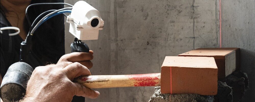
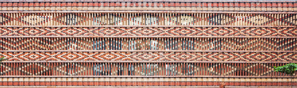
The main material of the space is red brick, 100,000 blocks. The colour is an indirect reference to the corporate identity of Ottogi, brings a secure and solid environment while the design adds up to the new values the brands to be associated with.
Moreover, the yellow is the second and more symbolic colour of Ottogi. It gives brightness and is directly associated to the quality delivery. The materials used inside are wood, fabric, ceramics and some stainless steel. Cave facing the road is a windowless semi-basement where food and beverages are served. About 400 fluorescent objects are hanged from the ceiling.


The interior of the space is finished with various patterns of bricks, and 8m bar and booth sofa. When going up through a narrow vertical staircase, a cube and a slope are facing each other. The cube sells goods developed for the project with a wall inside finished with bricks inside.


Large balloons hung on the ceiling with lights together gives the cheerful atmosphere. The stair-shaped slopes stacked by bricks are designed to sit more actively, and the small grass space created at the top provides an opportunity to watch the whole garden.
On the stairs, various fluorescent ceramic objects of artist, Lee Hyun-jung are placed. The shades bonded to the cube are finished with roofing material of punching metal to transmit sunlight and relieve the texture of the hard cube. About 40 landscapes made with ceramic under the roof.
The garden becomes the centre of the whole space. Changing with the seasons, it is composed of various flowering plants, sensitive to the wind, to react to the firmness of the bricks and show the balance of the entire garden. The ceramic table of artist, Lee Hyun-jung on the small hill combines with firs to make another space in the garden.
The hall is going to open to customers in the future but will be intended to be used for company events or tasting events. The hall, which can accommodate more than 50 people, has the form for multi-purpose use.
A large sliding door installed at the front of the hall opens about 6m, so it connects the hall and the garden like the bridge. The sala, last space, is not open space for the public. But the sala’s front is exposed to the garden. On the front of the square, more than 4,800 yellow spangles respond to wind and light, reflecting to the garden.
The interior of the Sala is designed to feel cozy and comfortable like domestic drawing room. Inside the space, there is furniture like a treasure box. When opening the door of the heavy furniture, tools for enjoying music, coffee, and wine, present users’ entertainment. All sala’s windows are also designed to open so that the entire garden can be viewed through the space.
Pictures by Park woo-jin.