#ConcreteWeek - Sharing Space Building
To end the series (for this time), we focus on an irregular polygon on an island that perfectly has succeeded to mix traditional craft with contemporary techniques.
Day 5: Taiwan
Arcadian Design recently completed this building in a satellite city near Taipei. The site is at a corner along a city boulevard and is surrounded by the nearby apartment complex at the backside and the neighbour building at the left side.
The shape of the site is an irregular polygon, and the overall building layout strategy applies the concept of “urban infill” theory. After fulfilling the building setbacks required by the local building code, the building plan was conformed to the existing terrain and shaped a polygon volume with diverse angles.
The client named the building as the “Sharing Space”, which is a three-floor building that advocated the idea of sharing its space as a cultural domain for the public to participate and experience. The functions of the building consist of a catering and recreation area on the ground floor, an artwork gallery on the first floor, and an exhibition area for life style on the second floor.
Facing the main road, the building facade toward the Southeast is a solid thick wall with no openings; except for a low-profile entrance at the Southwest corner where the building volume was raised by a single column. The illumination and ventilation in the core of the building are gained by cutting out a void space to form a trapezoid courtyard connecting the first and the second floors.
On the first floor, the courtyard is surrounded by the interior of the artwork gallery. Furthermore, the courtyard is also extended upwards to the outdoor space on the second floor, allowing the sunlight to pour into the courtyard from the top of the building.
Due to the different circumstances of the building bordering its front and back, the former is the busy main street while the latter is a garden with abundant greenery; therefore, the design of the façade openings implemented the strategy of “solid front vs. void back”.
In other words, by creating a clean and solid wall at the front side to maintain the continuity of the urban context as well as by rising the height of interior space at the backside to enhance the interaction with the rear garden. The large open frame of the rear façade implies the oriental landscape idea of “borrowed scenery”.
By means of the void space in the core of the building, not only the abundant sunlight was allowed to penetrate into the building but the void space between the first and the second floors was connected together. Through the integration of the vertical and horizontal circulations, the interrelationship between the first and the second floors was accomplished.
The visitors are induced to experience “the correlation of changing views with each move” by encircling, crossing, and interacting with the interior and exterior spaces alternatively. At first, one can enter the building from the low-profile entrance and view the rear greenery through the high-ceiling lounge space. After walking up to the first floor, one will enter the gallery with different heights with the courtyard in the middle. By looking upwards, one can have a vague glimpse of the water garden on the second floor.
Via a sunny outdoor stairway, one can reach to the water courtyard then walk into another indoors exhibition room. During the entire walking process, one can fully experience multi-layered spaces with various illumination, heights and scales in limited dimension.
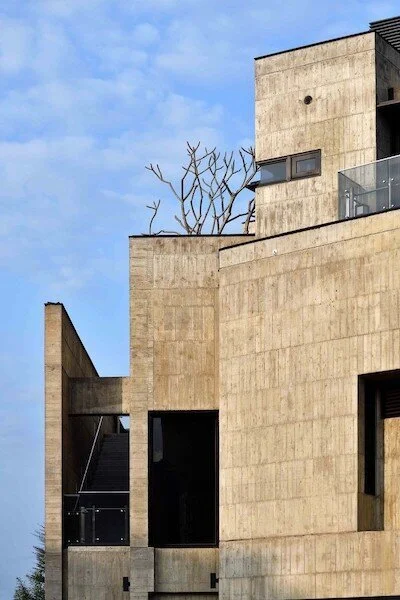
The main construction material of the building is architectural concrete with wooden texture. Besides, the front facade utilised indigenous bamboo coming from the middle part of Taiwan as the construction templates.
As a result, the particular concrete appearance with indented bamboo joint and undulated texture was achieved.
This bamboo texture delicately intensifies the contrast of light and shadow on the front facade.
The masculine architectural concrete and the delicate metal meshes on the top of the entrance were integrated together to weave a contrary yet harmonic poetic architecture.
Pictures by Huiland Photography, Jeffrey Cheng.


